Balticum - Telecommunications service
Balticum - Telecommunications service

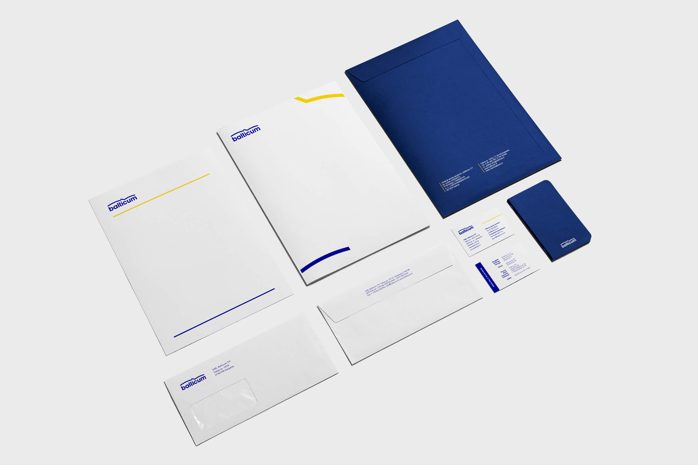
Challenge - „Balticum TV“ one of the biggest telecommunications provider in Lithuania decided they need a change for their 30th anniversary. With the wide range of home services (Internet, Smart TV) the company wanted to attract younger audiences, spread brand recognition and increase logo legibility but keep the basics intact. The integrity of the brand was very important as well.
Challenge - Hey there, this is the default text for a new paragraph. Feel free to edit this paragraph by clicking on the yellow edit icon. After you are done just click on the yellow checkmark button on the top right. Have Fun!
Challenge - „Balticum TV“ one of the biggest telecommunications provider in Lithuania decided they need a change for their 30th anniversary. With the wide range of home services (Internet, Smart TV) the company wanted to attract younger audiences, spread brand recognition and increase logo legibility but keep the basics intact. The integrity of the brand was very important as well.
Challenge - „Balticum TV“ one of the biggest telecommunications provider in Lithuania decided they need a change for their 30th anniversary. With the wide range of home services (Internet, Smart TV) the company wanted to attract younger audiences, spread brand recognition and increase logo legibility but keep the basics intact. The integrity of the brand was very important as well.
Solution - The logo was made to be more legible, modern and less decorated. The wordmark graphic element is a symbol of signal and dinamic energy. The darker shade of blue was chosen in order to stand out from the competitors. To maintain the emotional link to the old version, yellow was kept as a supporting color.
Solution - The logo was made to be more legible, modern and less decorated. The wordmark graphic element is a symbol of signal and dinamic energy. The darker shade of blue was chosen in order to stand out from the competitors. To maintain the emotional link to the old version, yellow was kept as a supporting color.
Solution - The logo was made to be more legible, modern and less decorated. The wordmark graphic element is a symbol of signal and dinamic energy. The darker shade of blue was chosen in order to stand out from the competitors. To maintain the emotional link to the old version, yellow was kept as a supporting color.
Solution - The logo was made to be more legible, modern
and less decorated. The wordmark graphic element is a symbol of signal and dinamic energy. The darker shade of blue was chosen in order to stand out from the competitors. To maintain the emotional link to the old version, yellow was kept as a supporting color.
Solution - The logo was made to be more legible, modern and less decorated. The wordmark graphic element is a symbol of signal and dinamic energy. The darker shade of blue was chosen in order to stand out from the competitors. To maintain the emotional link to the old version, yellow was kept as a supporting color.
SERVICES: REBRANDING, LOGO DESIGN, VISUAL IDENTITY,
STATIONERY DESIGN, STYLE GUIDE, SIGNAGE, PRINT.
SERVICES: REBRANDING, LOGO DESIGN,
VISUAL IDENTITY, STATIONERY DESIGN, STYLE GUIDE, SIGNAGE, PRINT.


Selected works
LogosProject type
Natural Mineral WaterCorporate design
Girion - Forestry servicesCorporate Design
Ošia - Beach BarIdentity Design

Clothing BrandProject type
Fast food gastropubProject type

Sportswear storeProject type

Textile manufacturingProject type
Documentary movieLogo, identity program.
Movement PracticeProject type

ContactProject type
All content © by David Budko
© 2019 by David Budko
© 2019 by David Budko